Info
Based on CSS Crash Course
Intro
CSS - Cascading Style sheets
Cascading style sheets are called cascading because several different style sheets can be active for a single document at the same time. When multiple style sheets are in effect, they are applied to the document in a pre-determined sequence set by the browser: their formatting instructions can be thought of as cascading from one style sheet to the next.
NOT a programming language
Style sheet/Styling language
Used for website style design
Can be extended with Sass/Less
User experience of content matters
Three Methods for Adding CSS
- Inline CSS: Directly in the html element (NO! quick test)
<h1 style="color: red">Hello World!</h1>Keep the presentation and functionality and styling separate or as much as possible
- Internal CSS: Using
<Style>tags within a single document
<head>
  <style>
    /* CSS rule */
    h1 {
      color: red;
    }
  </style>
</head>
<body>
  <h1>Hello World!</h1>
</body>
Can only be used in the particular html file and fatten the html file as well
- External CSS: Linking an
external.cssfile(BEST)
/*This is a CSS file, style.css*/
h1 {
  color: red;
}<head>
<link rel="stylesheet" href="../style.css" />
</head>
<body>
<h1>Hello World!</h1>
</body>CSS Selectors
selector {
  property: Value; /* This is a declaration */
}

/* 1. Element selector */
p {
  color: blue;
}

/* 2. Class selector */
.c lastName {
  color: blue;
}

/* 3. id selector */
#name {
  color: blue;
}

/* 4. Grouping selectors */
div,
.blue {
  color: blue;
}

/* 5. Combining selectors (not limited to element selectors) */
/* a. element with class selector */
p.big {
  font-size: 20px;
} /* Every p that has class="big" */

/* b. child selector */
article > p {
  color: blue;
} /* Every p that is a direct child of article */

/* c. descendant selector */
article p {
  color: blue;
} /* Every p is inside (at any level) of article*/

/* 6. Pseduo-Class selectors*/
selector:pseduo-class {
  color: blue;
}
/*
:link
:visited
:hover
:active
:nth-child(1)	:nth-child(odd)
*/
Conflict Resolution
Origin precedence
- when in conflict: Last Declaration Wins
- when not in conflict: Declarations Merge
Inheritance: DOM (document object model) Tree. All the children and grandchildren will inherit parent's properties without specification
Specificity: Most Specific Selector Combination Wins
Score:
style="..."IDClass, pseduo-class, attributeElements
Styling
Text
body {
  color: red;
  color: #00ff00;
  color: rgb(0, 0, 255);
  /* 	Rely on users computer
    	If the first font cannot be applied then apply the second one */
  font-family: Arial, sans-serif;
  font-style: italic;
  /* default is 16px */
  font-size: 16px;
  /* relative sizing */
  font-size: 120%;
  font-size: 2em;
  font-weight: bold;
  /* Same as above */
  font: bold 16px Arial, sans-serif;

  text-decoration: underline;
  text-decoration: none;
  text-transform: uppercase;
  text-align: center;

  letter-spacing: 0.2em;
  word-spacing: 1em;
  line-height: 1.6em;
}- Web-safe font(can be directly used); special font(needed to be imported)
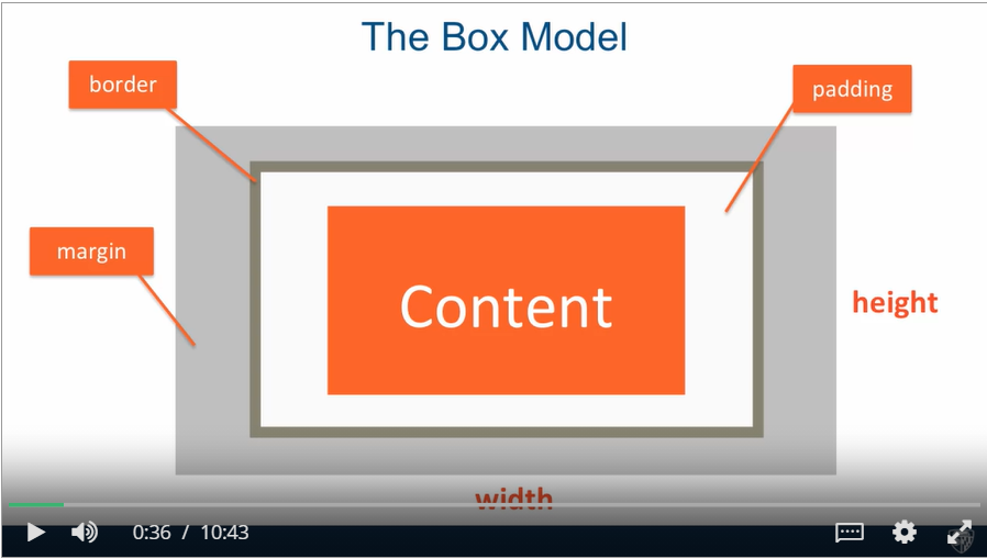
Box Model
- Every element is considered as a box.
/* All same */
p {
  margin-top: 5px;
  margin-bottom: 5px;
  margin-right: 10px;
  margin-left: 10px;
}
/* top right bottom left */
p {
  margin: 5px 10px 5px 10px;
}
/* top and bottom right and left */
p {
  margin: 5px 10px;
}

#box {
  padding: 10px;
  border: 5px solid black;
  margin: 40px;
  /* by default width is the content width */
  width: 300px;
  /* now is box width */
  box-sizing: border-box;
  height: 50px;
  overflow: hidden;
  overflow: auto;
}

/* star selector select all elements */
* {
  /* override some default setting in the user agent stylesheet made by the
    browser */
  /* box-sizing cannot be inherited */
  box-sizing: border-box;
  margin: 0;
  padding: 0;
}

/* Margins collapse (only applied to top and bottom, not left and right) */
/* the actual margin between these two boxes is the larger margin 30px */
#box-1 {
  margin-bottom: 20px;
}
#box-2 {
  margin-top: 30px;
}
background
#bg {
  background-color: blue;
  background-image: url("smimg.png");
  background-repeat: repeat-x;
  background-repeat: no-repeat;
  background-position: bottom-right;
  /* same as above */
  background: blue url("sminmg.png") no-repeat bottom-right;
  opacity: 0.8;
}
List
ul {
  list-style: square;
  list-style: none;
  list-style-image: url("../images/check.png");
}
li {
  display: inline;
}
Positioning
- Positioning Elements by Floating
<!DOCTYPE html>
<html>
  <head>
    <meta charset="utf-8" />
    <title>Floating Elements</title>
    <style>
      div {
        background-color: #00ffff;
      }
      p {
        width: 50px;
        height: 50px;
        border: 1px solid black;
        display: flex;
        align-items: center;
        justify-content: center;
      }

      #p1 {
        background-color: #a52a2a;
        /* when floating elements, the browser takes them out of the regular document flow*/
        /* margins never collapse when floating elements */
        float: left;
      }
      #p2 {
        background-color: #deb887;
        float: right;
      }
      #p3 {
        background-color: #5f9ea0;
        /* resume the regular document flow */
        clear: both;
      }
      #p4 {
        background-color: #ff7f50;
      }
    </style>
  </head>
  <body>
    <h1>Floating Elements</h1>

    <div>
      <p id="p1">1</p>
      <p id="p2">2</p>
      <p id="p3">3</p>
      <p id="p4">4</p>
      <section>
        This is regular content continuing after the the paragraph boxes.
      </section>
    </div>
  </body>
</html>
Static
- Normal document flow
- Default for all, except
html
Relative
- Element is positioned relative to its position in normal document flow
- Can add offset properties
top bottom right leftto push it where we want - Element is NOT taken out of normal document flow
- Even if moved, its original spot is preserved
- Offsetting the relative container element offsets its contents as well
Absolute
- All offsets are relative to the position of the nearest ancestor which has position set on it, other than static
- By default,
htmlis the only element that has non-static positioning set on it (relative) - Element is taken out of document flow
Fixed
- Always in the same position
<!DOCTYPE html>
<html>
  <head>
    <meta charset="utf-8" />
    <title>Positioning Elements</title>
    <style>
      * {
        box-sizing: border-box;
        margin: 0;
        padding: 0;
      }
      h1 {
        margin-bottom: 15px;
      }

      div#container {
        background-color: #00ffff;
        /* anchor the container position relative */
        position: relative;
      }
      p {
        width: 50px;
        height: 50px;
        border: 1px solid black;
        margin-bottom: 15px;
      }
      #p1 {
        background-color: #a52a2a;
        position: relative;
        top: 65px;
        left: 65px;
      }
      #p2 {
        background-color: #deb887;
      }
      #p3 {
        background-color: #5f9ea0;
        position: absolute;
        top: 0;
        left: 0;
      }
      #p4 {
        background-color: #ff7f50;
      }
    </style>
  </head>
  <body>
    <h1>Positioning Elements</h1>

    <div id="container">
      <p id="p1">1</p>
      <p id="p2">2</p>
      <p id="p3">3</p>
      <p id="p4">4</p>
    </div>
  </body>
</html>
Form
<form class="my-form">
  <div class="form-group">
    <label>Name: </label>
    <input type="text" name="name" />
  </div>
  <div class="form-group">
    <label>Email: </label>
    <input type="text" name="email" />
  </div>
  <div class="form-group">
    <label>Message: </label>
    <textarea name="message"></textarea>
  </div>
  <input class="button" type="submit" value="Submit" name="" />
</form>
.my-form {
padding: 20px;
}
.my-form .form-group {
padding-bottom: 15px;
}
.my-form .label {
display: block;
}
.my-form input[type="text"],
.myform textarea {
padding: 8px;
width: 100%;
}
.button {
background-color: #333;
color: #fff;
padding: 10px 15px;
border: none;
}
.button:hover {
background-color: red;
color: #fff;
}Responsive Design
Media Query
- Design for different devices
@media (max-width: 600px) /* Media feature (resolves to true or false) */ {
  /* If True, styles within curly braces apply */
  p {
    color: blue;
  }
}

/* Common media query features */
@media (max-width: 800px) {
}
@media (min-width: 800px) {
}
@media (orientation: portrait) {
}
@media screen {
}
@media print {
}

/* Can be combined */
@media (min-width: 600px) and (max-width: 800px) {
} /* AND */
@media (min-width: 900px), (max-width: 800px) {
} /* OR */

/* Media query common approach */
p {
  color: blue;
} /* base styles */
@media (min-width: 1200px) {
}
@media (min-width: 992px) and (max-width: 1199px) {
}
Responsive Web Site
Site designed to adapt its layout to the viewing environment by using fluid, proportion-based grids, flexible images, and CSS3 media queries
Use
%to achieve fluid width12-Column Grid Responsive Layout
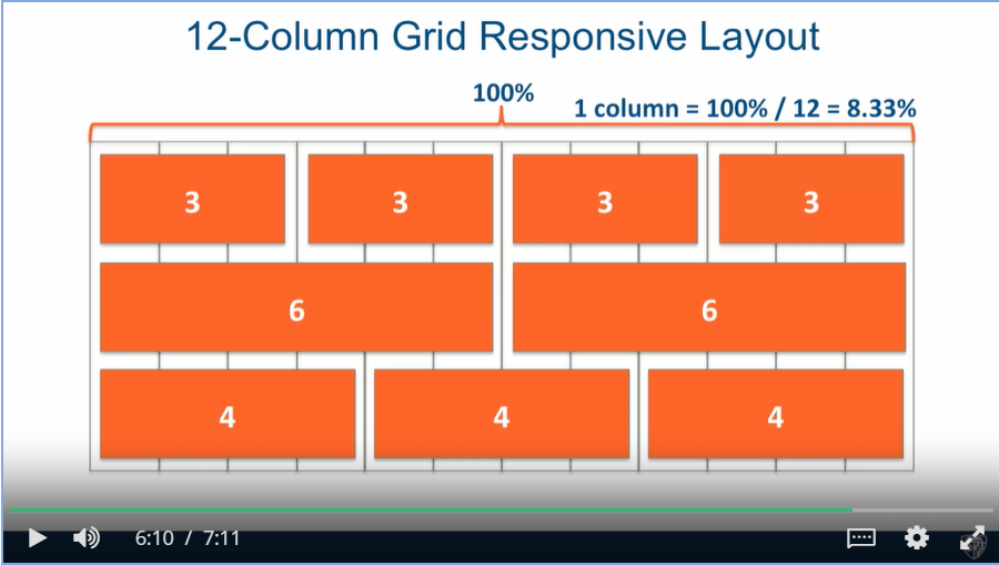
12-columnGrid nested grid
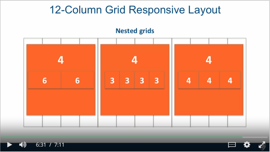
nestedGrid
Viewportmeta tag to turn off default mobile zooming<meta name="viewport" content="width=device-width, intial-scale=1" />
Bootstrap 3.
- Bootstrap is the most popular HTML, CSS, and JS framework for developing responsive, mobile first projects on the web.
- Mostly CSS classes
- Mobile first = PLAN mobile from the start
- Bootstrap JavaScript depends on jQuery
Bootstrap Grid System Basics
<!-- Must be inside container (or container-fluid) -->
<div class="container">
  <!-- Create horizontal groups of columns
		Applies negative left/right margins -->
  <div class="row">
    <!-- Bootstrap column class: col-SIZE-SPAN
			SIZE: screen width range identifier; column will collapse below that width, unless another rule applies
			SPAN: how many columns element should span (1-12) -->
    <div class="col-md-4">Col 1</div>
  </div>
</div>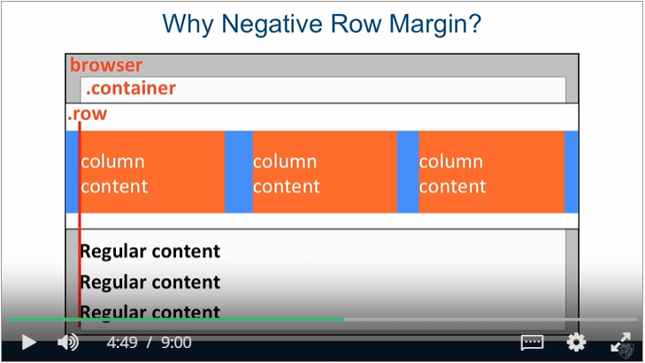
Navbar
<header>
    <!-- Bootstrap provides the classes, a base class and a subclass -->
	<nav id="header-nav" class="navbar navbar-default">
    	<div class="container">
            <!-- A wrapper class that a lot of other classes will depend on being in this position in order to work properly -->
            <div class="navbar-header">
                <!-- Make it float to the left so image and the brand name are in the same line, visible only ilarge and medium size -->
                <a href="index.html" class="pull-left visible-md visible-lg">
                	<div id="logo-img" alt="Logo image"></div>
                </a>

                <!-- For company brand name and it floats to the left -->
                <div class="navbar-brand">
                    <a href="index.html"><h1>Chinese Resteraunt</h1></a>
                    <p>
                        <!-- small image no need to worry about the response -->
                        <img src="" alt="">
                        <span>Kosher Certified</span>
                    </p>
                </div>

                <!-- navbar-toggle give the position; collapsed is a bootstrap.js plugin; plugin use data-target attribute to know where to target the collapsing behaviour -->
                <button type="button" class="navbar-toggle collapsed" data-toggle="collapse" data-target="#collapsable-nav" aria-expanded="false">
                    <span class="sr-only">Toggle navigation</span>
                    <span class="icon-bar"></span>
                    <span class="icon-bar"></span>
                    <span class="icon-bar"></span>
                </button>
            </div>

            <!-- required bootstrap class -->
            <div id="collapsable-nav" class="collapse navbar-collapse">
           		<!-- id for styling; nav, navbar-nav means a component of navbar; navbar-right: pull to the right -->
                <ul id="nav-list" class="nav navbar-nav navbar-right">
                    <li>
                      <a href="menu-categories.html">
                        <!-- Bring in an icon font, provided by bootstrap -->
                        <span class="glyphicon glyphicon-cutlery"></span><br class="hidden-xs"> Menu</a>
                    </li>
                    <li>
                      <a href="#">
                        <span class="glyphicon glyphicon-info-sign"></span><br class="hidden-xs"> About</a>
                    </li>
                    </li>
                    <li id="phone" class="hidden-xs">
                      	<!-- trigger the phone call feature -->
                        <a href="tel:410-602-5008">
                        <span>410-602-5008</span></a><div>* We Deliver</div>
                    </li>
        		</ul>
        	</div>
        </div>
    </nav>
</header>
#header-nav {
background: yellow;
border-radius: 0;
border: 0;
}
#logo-img {
background: url() no-repeat;
width: 150px;
height: 150px;
margin: 10px 15px 10px 0;
}
.navbar-header button.navbar-toggle {
clear: both;
}Jumbotron
- One way to load a different size image depending on the browser width is to use 'background-image' CSS property and load a different 'url' in different media queries.